
July 4, 2019
Finance apps definitely require an eye for detail. Having worked in the fintech industry for a long time, we’ve learned all about the issues designers face. Based on our experience, we put together practical tips to keep in mind when designing great fintech apps.
This is the first in a series of design-themed posts, so make sure to follow us and stay tuned for more!
Onboarding
First Impressions
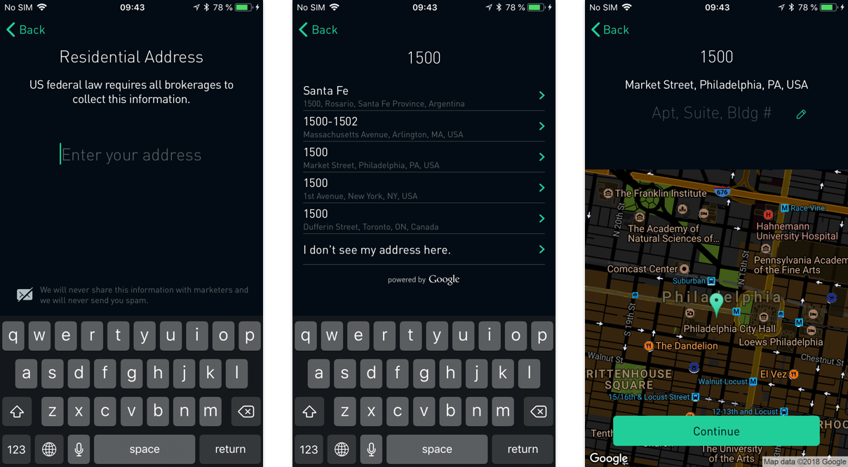
We all know that when it comes to UX, less is more. Onboarding should be quick and seamless. Forms should be short and easy. Ask the minimum, give the maximum. The truth is that financial services operate under a lot of regulatory constraints and need to collect a lot of user information to comply with KYC (Know Your Customer) and AML (Anti-Money Laundering) laws. To allow a user to use your services, you’ll need to get an awful lot of data about them.
First rule: leverage the power of first impressions. In one of the user research sessions, we conducted our interviewees shared that they wouldn’t feel eager to enter their personal details prior to experiencing the actual app. Users will be more willing to go through all the KYC pain once you convince them about the trustworthiness and usefulness of the app upfront.
Make Forms Great Again
Still, sooner or later you’ll need to ask for this data, so make sure you do it in style. The design of the forms and their usability will have a great impact on your conversion rate. Use inline validation to catch any errors quickly. Don’t forget about including a progress indicator, it will help the user locate themselves and create a sense of accomplishment. Always remember to make sure the user can easily save and access the form again to finish it later.
Explain Why You Need the Data
A few words of explanation are always a good idea, and sometimes they can be a life saver. If you need someone’s address or date of birth, make sure to explain why you need those details (e.g. for user verification). Since, you know, people sometimes lie about their age on the internet (why be 50 when you can be 21?). They probably wouldn’t do this knowing that it would result in failed registration.
Security
Letting The Right One In
Of course security is a major topic when dealing with finance. Authentication is key, but poorly designed authentication systems fail in two ways. Either by letting the wrong people in or by making it too hard for the right people. SMS/magic link verification is not optimal, since anyone who can get their hands on the phone can sign in. The advantage of mobile is biometric authentication, on Android this works via fingerprint, for iOS there’s Touch/Face ID. However, this doesn’t erase the fact that you always need to provide a fallback option in case biometric login doesn’t work or isn’t supported.
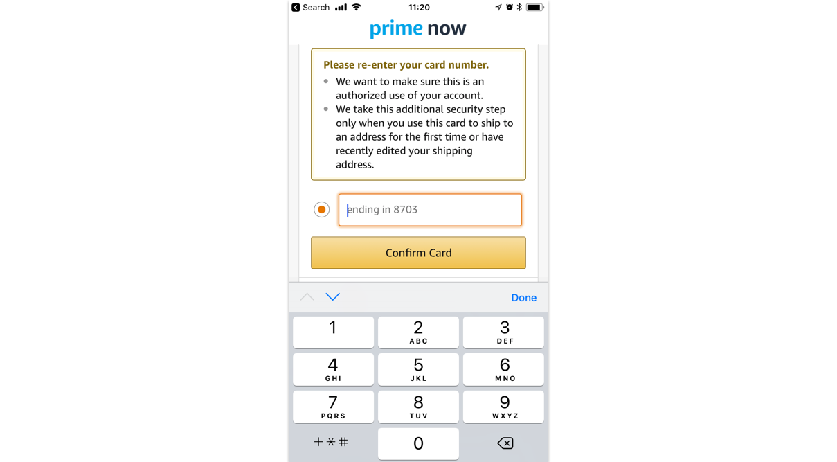
Design For The Threat Model
A threat model outlines which information or actions are sensitive and require stronger authorization (e.g money transfers) and which provide little risk. As long as the application knows that the user is logged in, it can grant access to the low risk elements, while keeping the user protected from fraudulent acts.
A great example is Amazon’s threat model: it lets you make 1-click purchases without the need of authorization, but as soon as you want to ship something to a new address you’ll need to re-enter your credit card details.
Locking Out
For additional security, your team might decide to implement a feature to lock out users after a few unsuccessful attempts. That’s great if the account is being hacked, but less awesome for users who can’t remember their credentials. So when dealing with lock outs:
- Always warn the user beforehand (i.e. “you can attempt to fill in your code 2 more times before you will be locked out”)
- Increase the number to 10 or 20 times before a lockout, or keep it temporary (i.e. 5 minutes)
- Let users authorize in an alternative way or provide direct link to customer care who can help solve the issue quickly (there’s nothing more frustrating than needing access to your finances and having to wait several days)
To Mask or Not to Mask?
Displaying credit card or security codes is like getting naked, it’s great when the moment’s right 👀. It’s totally fine to display the credit card number when user enters it in the form and needs to make sure they have entered the correct number. But don’t flash the number when it’s not necessary. Especially because people still don’t how to secure their data themselves.
Make Things Clear
Visualize it
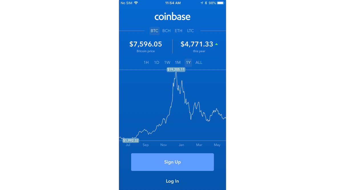
For most people, finance seems boring and too difficult to understand. Visualizing data is a great way to break this cognitive barrier. If done right, you can give your users valuable insights in an engaging way, help them understand their spending, savings and investments and to stay on top of their money. Before you jump on designing charts, make sure you understand what and why you want to tell user, oh and always pick the right chart to tell your story.
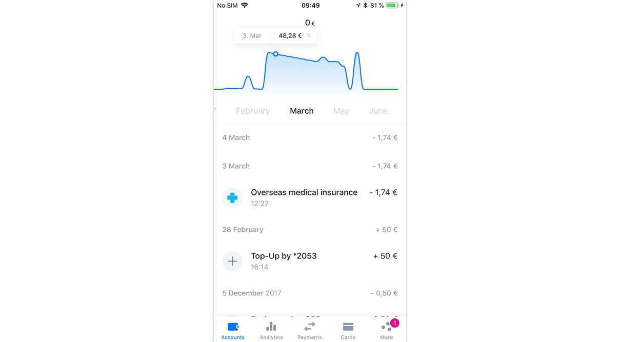
Embrace The Whitespace
There’s usually a lot information to be packed into a finance app, so for the sake of your users you need to be smart about its presentation.
- Add hierarchy to the data with font size, font weight, color, etc.
- Use whitespace, the large spaces between layout elements (aka Macro White Spaces), generously to guide the users through the page and the focus areas.
Accessibility
Money is used by everyone, and the same should apply to finance apps. It’s important to take people with disabilities into consideration during the design process. And following accessibility rules will make your product more usable for everyone. Use easy-to-read fonts and keep things high contrast for good readability but don’t rely on color alone, since color blindness affects close to 10% of the population. Speak Your User’s Language If you’ve been in the financial world for a while, you’ve probably have picked up some of its jargon and complex terminology. Some of it will be still a total mystery for your users, unless you target an expert audience. Keep your copy clear and simple and make sure it’s understandable for everyone. We all know finance is a serious business, but try to not make it sound too formal or official.
All About The Digits
Pick The Right Fonts
We’ll skip the rules for typography, as we take our fonts serious enough to turn this topic into a separate blogpost. The main thing is: make sure the font you pick, support international currency symbols. It might come as a surprise, but a lot of them don’t! If you’ve already paid the license, using ISO codes (such as EUR, USD, GBP) instead is a worthy alternative.
Check Numbers, Date & Time Formatting
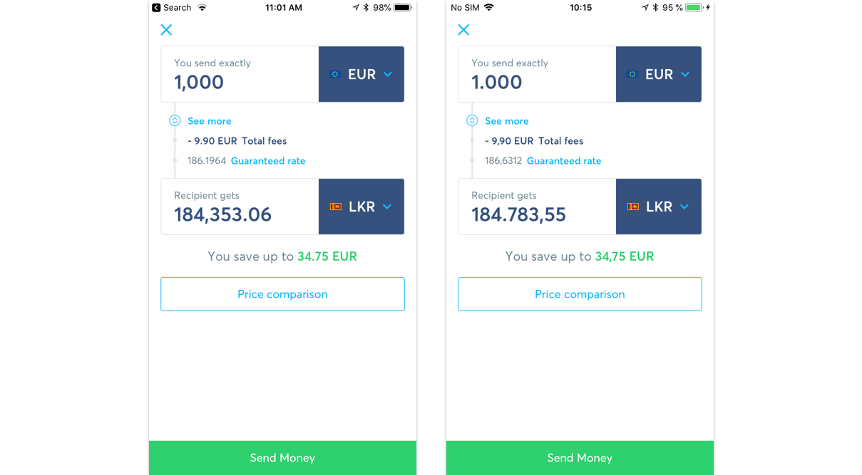
It’s a big world, and things run differently in different places 💱. We have different electricity outlets, drive our cars on different side of the road, and have different ideas when it comes down to numbers. “2,000” and “2.000” might mean two or two thousands, depending if you’re American or French. 9/2/2015 might mean 9th of September or February 9th. Make sure to be consistent in your designs (don’t mix different conversions) and talk with developers to implement localization, so that the numbers displayed are depended on the user’s browser or phone settings.
Keep it Plus Size Friendly
Currencies vary in value and some have more digits than others, i.e. 100 American dollars is around 287.493 Colombian pesos. So it’s important to make sure all the numbers will fit in nicely, by using the right layout and spacing. Also remember to always display amounts with two digits after decimal (so that’s 287.493,00 pesos to be correct!). Exceptions are currency exchange rates and…cryptocurrencies where you might need more digits after decimals: 100 American dollars is around 0,0122 BTC at the time of writing.
Red Isn’t Rad
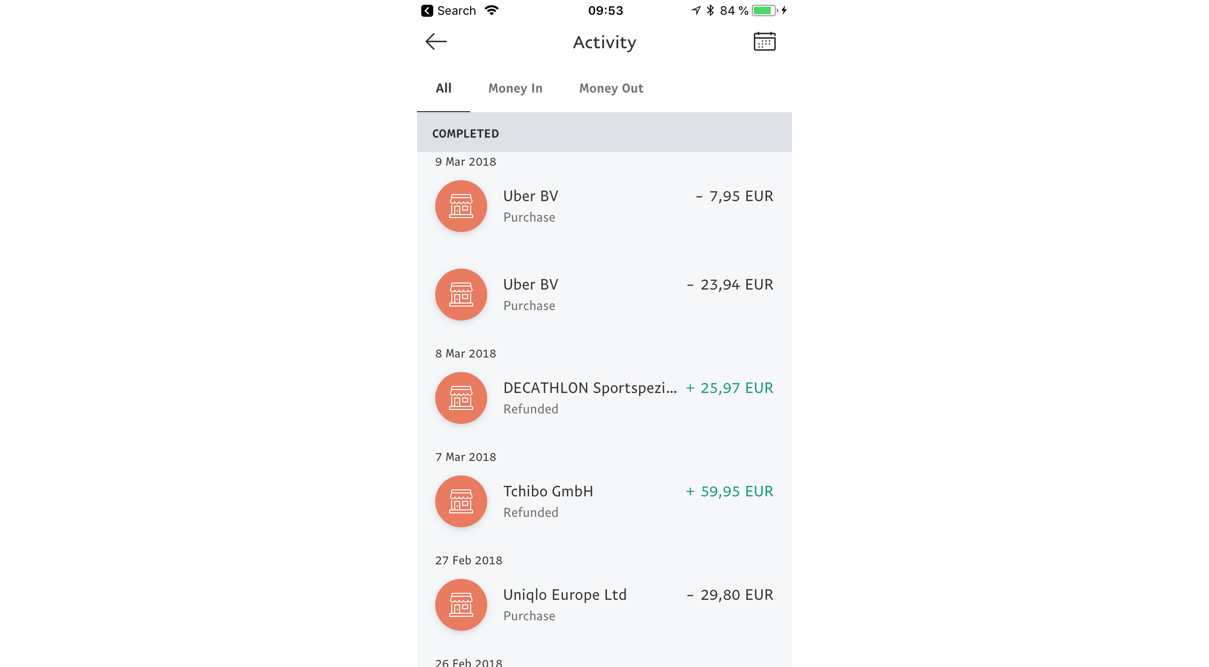
When it comes to consumer banking, people usually have more outgoing than incoming transfers. Spending more than you receive is already annoying in itself, so no need to make users feel worse by showing those negative, red numbers. Your app won’t look as good, and users will feel irritated about their bank balance. It’s enough to only color code incoming transactions, this will make them easy to differentiate and won’t overwhelm the design. So you can save the red to make real issues or errors stand out.
Summary
As you can see, finance can be a tricky design topic to work with, but we hope that with our advice we’ve made the task a bit easier! And make sure to take a look at our case study for dine+go, the new app which makes paying for dinner quick and invisible.
This post was written by Agnieszka Bratek, one of YND’s Senior Product Designers. Together with YND’s design team, she’s helped companies successfully launch apps across various industries: from mobile payment, finance management, travel booking to E-commerce. In need of some brain power? Reach out to us via hello@ynd.co with questions about your projects.